Tuesday, 30 September 2014

Institutions in the media: The BBC

Handout design
Lesson powerpoint 

-

Mr Bush's feedback:
WWW

  • Interactive start - involving audience with questions
  • Fluent, articulate presentation style
  • Use of whiteboard
  • Detailed, well presented handout 
  • Good, simple powerpoint slides - well designed
  • Includes key information re: ownership
  • Key terminology: PSB
EBI 
  • Be more positive when receiving feedback 
  • Some lack of clarity re: misinformation of facts (1995 relaunch?)
  • Explain assertions/statements - left wing bias? how? 
  • Include images on slides 
  • Forgot about plenary 
-
Self-reflection feedback:
WWW 

  •  Good design of handouts and powerpoint
  • Well presented information about institution 
  • Plenty of detail about history, control, influence and synergy of the BBC 
EBI 
  • Further interaction with class (more positive and rewarding)
  • Lack of a plenary 
  • Explain statements made and controversy behind alleged left wing bias
  • Include images on powerpoint slides
-
Twitter (Kunal, Mikaeil & Alisa)
- Social networking site est. in 2006
- Four layout revamps since 2006 
- Traditional newspapers 'killer'
TimeWarner (Indera & Samsam)
- World's third largest TV networking and entertainment conglomerate 
- Founded in 1990 
- Owns many subsidiaries such as HBO and Warner Bros.
Dreamworks (Zubair, Shervin & Fasih)
- Founded in 1994
- Screens in many countries including Poland, US, UK, Italy.
- Founded by Steven Spielberg, Jeffery Katzenberg and David Geffen.
ITV (Luke & Lee)
- First broadcast in 1959
- Formed by a corporate takeover by Granada plc and Carlton Comm.
- ITV cofounds Freesat with the BBC
Disney (Ahmed, Abdiasis & Mansour) 
- Disney patented technicolour for many years, making them the only company allowed to release colour films
- The DisneyWorld resort is around the same size as San Francisco 
- At its time, Snow White (at 1.4million) was considered a joke for how expensive it was to make
Film4 (Jasmine & Harmony)
- Funding derives from adverts/commercial 
- Has a niche audience
- Recently launched Film 4.0 which is a digital/online area
BSkyB (Ryan & Kirath) 
- Founded by entrepreneur Rupert Murdoch 
- 10.1 million customers as of June 2011
- £6bn revenue annually as of 2011 
Sallmaan (NewsCorp) 
- Formed in Australia by Rupert Murdoch
- NewsCorp has acquired newspapers such as The London Times and The New York Post
- FoxBroadcasting is a subsidiary 

Sony
- First electronic product was a tape recorder named the 'Type G'
- Encouraged development of the Compact Disc (CDs)
- Purchased Colombia Pictures in 1989
TrinityMirror (UK)
- Largest British newspaper group publishing 240 regional papers in the UK
- Founded in 1903
- Faces controversy over alleged phone-hacking 

Monday, 29 September 2014

12C Sound presentations and homework

Presentation feedback/learner response


Mr Halsey's feedback:
  • Brilliant design - stunning page layout 
  • Clever idea and clear thought behind it 
  • Potential criticism - is there enough of a jump between the two? Contrapuntal should 'jump out'
-
Self-reflection feedback:
WWW 

  •  Good design of collages
  • Thoughtful comparison between concept inspiring selection of contrapuntal and parallel images
  • Well explained presentation
EBI 
  • Lacks enough of a difference between the contrapuntal and parallel ideologies 
  • Colour scheme between collages could've been more specialised per collage
  • A video could be a better presentation method 
-

"Learner response: compare your presentation against your evaluation of the top three presentations in the class. Who did you think was best and why?"

I evaluated Ryan, Alisa and Kacper's presentations as the top three in the class. This is because all three exhibited an apparent contrast among their parallel and contrapuntal collages according to the selected track. 

Alisa presented a contrast among Will.I.Am's 'Bang Bang' from 'The Great Gatsby' OST and the scenes from the party in the film, compared to the gore of horror film 'Scream. Indubitably a better approach to showing contrapuntal .v. parallel than my choice of track and accompanying collages. 

Kacper took an amusing approach to exhibiting contrapuntal .v. parallel as he chose hip-hop track 'F**kin' Problems' by rapper A$AP Rocky. The parallel collage featured females dressed (or not quite dressed) provocatively, displaying sex appeal and following the theme of objectifying women which is presented in the lyrics of the song. The contrapuntal collage features innocent young girls as well as nuns which completely differ from the implications of the parallel collage as well as the track. 

Ryan's presentation was effective of all and in my opinion the best, as it showed an apparent contrast among contrapuntal .v. parallel as well as provoking humour within the audience. This was done due to the significant contrast between the track (Bob Marley's 'Three Little Birds') and an accompanying violent scene from the 1983 American crime drama film 'Scarface'. This demonstrates how contrapuntal sound can be used in horror films for instance, to make the feel of the accompanying visuals sinister - a common use of contrapuntal sound in film. 


-  Find a film clip on YouTube that uses sound in an interesting way. Analyse the use of sound, making sure you use the key language we have learned about sound in film:
  • Diegetic and non-diegetic sound
  • Parallel and contrapuntal sound
  • Sound bridges 

Silver Linings Playbook (Pat and Tiffany "running" scene)


This clip from 'SIlver Linings Playbook' uses sound effectively in order to rapidly change the feel of the action as the psychologically impaired characters change moods/attitudes several times during the clip. The beginning of the clip features 'Buffalo' by Alt+J as a non-diegetic background music track to support the melancholic action reinforced by the actors' facial expressions. There is no dialogue at all in the expository seconds of the clip but sound effects are enhanced to further reinforce the lack of sound by meliorating the diegetic-sound (i.e. windows shutting), hence emphasising the glum feel of the scene. When the scene changes to feature Bradley Cooper running, his footsteps are acoustically meliorated to continue the lack of dialogue, his panting is also intensified by the use of sound. Until, suddenly Jennifer Lawrence's character shouts and the non-diegetic soundtrack fades off. This continues as so until Bradley begins to run away when another song is background to the high-paced scene. This continues as such until J-Law's character catches up once again and dialogue is significant as an emotional scene is exhibited, upon which the music begins to fade into a high-bass sound effect to parallel the intense emotions of the scene and dialogue. 


Thursday, 25 September 2014

Lighting

------------------------------------------------------------------------
Take a look at the following stills.
1.Identify examples of high and low-key lighting.
2.Say which depict top, back or under lighting.
3.What effects are created by the lighting in each image? "

--------------------------------------------------------------------

      Low-key lighting is exhibited in this still to show the shadow created on one side of the actress' face. The key light's focus on the other side adds emphasis to the smoke which provides the still with dramatic shadows on the other side. This primarily depicts back-lighting as there is a light derived from behind the woman. A dramatic effect is created by the lighting and it connotes seriousness and a sense of intimidation is established by the woman's prominent expression with support of the lighting created. 


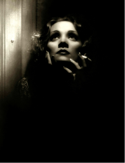
     Low-key lighting is shown in this still to give a dramatic/horror feel to the still of the actress. However, the top-lighting also gives a glamorous look to the lady as her 
facial features are accentuated. This depicts top-lighting. The 
effects created are of glamour, femininity and fear.


          This still shows high-key lighting as no shadows are created and the subject is entirely in  natural daylight. This depicts top and back lighting as the picture is in full light. The effects created are realistic and the character's attire of authority is in full sight as his facial expression also connotes intimidation and superiority. 
     

     Low-key lighting is manipulated as shadows are created on the top-left part of the actor. The contrast of the lighting is reduced by filler lights and the actor's upper-body is highly exposed. This mainly depicts top lighting because the shadows are created on the lower part of his body. The effects created depict a masculine male who is presumably highly skilled physically and someone who has a fairly arrogant character.


          High-key lighting is crafted as the subject is fully lit, excluding the one shadow which indicates a vertical object; most certainly a weapon; pointed towards the woman, causing her to express such a fearful facial expression.  This mainly depicts top-lighting.The effects exhibit the woman's immense sense of fear as her shadow is reflected against a wall and the faint shadow next to it suggests that she is to be attacked by a vertically held weapon.


          This still shows high-key lighting but can be misconceived 
     as low-key due to the chiaroscuro effect of the shadows
  from the blinds. Behind the blinds however, natural 
lighting from the daylight is applied into the frame. 
This mainly depicts non-studio lighting as the only granted exposure to the still is shown through the blinds. The
effect of this enhances the intimacy of the scene and could
be interpreted in many metaphoric ways, suggesting for instance that the natural light being the only source of light means that their privacy is withheld. 


    Low-key lighting causes the back-lighting to form the silhouettes and the elongated shadows of the four figures. The effect of this includes mystery as well as fear because the audience suspects that the figures may have a grotesque appearance waiting to be unveiled to evoke shock from the audience.


This still samples low-key lighting because dark shadows 
are created to heighten the desired sense of fear expressed by the lady's facial expression. This depicts top-lighting 
as the female's features are accentuated alongside her 
fear-filled face. The effect exerted by the lighting helps 
the audience to empathise the dark emotions felt by the actress in this particular scene.


    High-key lighting is exhibited due to the lack of shadows and the natural look of the actress and her surroundings. This depicts top-lighting as her face is shone upon and her facial features are accentuated in beauty. The effect of this is to exhibit the lady in a glamorous manner.


This is a brilliant still exemplifying high-key lighting during a nighttime setting, which could be mistaken for low-key. The depicted back-lighting presents the man as a mysterious semi-silhouette as his other half is shadowed as it is consumed in darkness. The effect of this is brilliant in a visual aspect as the bars on this depicts a stealthy scene and connotes secrecy and discretion of action. 


    Low-key lighting is utilised in the displayed still to suggest ambiguity of thriller yet romance. The effect created is worth speculation as the shadows connote secrecy, reinforced by the handheld gun in the man's possession. Nevertheless, this is a common craft of lighting to show intimacy between a couple as the heads of the characters are shadowed onto a wall behind. Top-lighting is also applied to show the facial expression on the man's face as he caresses the lady. 


Tuesday, 23 September 2014

'Reading an image'


Print advert analysis - readings 

ClearChannel - iTV Footballers Wives Billboard Print Advertisement


This print advert was published in 2004 for iTV's controversial drama television show. The image features a monochrome colour scheme, not to mention the copy of the text being in trademark colours of iTV and the show; below the image's framing in the entirety of the poster. The picture generally has a shadowy effect to it, which doesn't just accentuate the spherical shape of the footballs but could also suggest ambiguity in the lives of the footballers' wives as a particular shade of colour doesn't need to be added to narrow-down associations to their lives.
The displayed denotation is exhibited by the composition of two footballs placed horizontally aside with the holes for the ball-pump facing towards the camera - being the subject matter. It may also be noteworthy that the footballs are only partially shown vertically (and horizontally too). The representation is however of a sexual innuendo, with the context of the professional career intact with the stereotyped image of the wives of footballers' to be sexually appealing. This is the dominant reading of this image as it cleverly associates the sport with the female assets of the wives of the footballers who are most commonly attractive supermodels. A reading in opposition however would be that this objectifies women and is degrading in a way that the wives are only reputable for their sexual assets, rather than their personalities and views/morals. These opposing readings could be negotiated however, concluding that the footballers' wives take pride in their bodies and accept it as an attribute to their reputation, also complimenting the lavish lifestyles of footballers. 

Thursday, 18 September 2014

Film Poster Analysis - 12/09/2014

Film Poster Analysis

"Look at the following film posters and decode the information you are given using the following questions. For each question, explain what aspects of film language helped you answer the question.
1.What do you think the film is about and what might the storyline be?
2.What genre(s) do you think the film belongs to?
3.Who do you think is the target audience?" 

 Poster 1 - Blade Runner 
1. The poster suggests that the film is about a man who has scientific intelligence to create a robot. The story-line may include the ordeal faced by this created robot as he/she may have selfish intentions or another means of causing it to be 'his problem'.
2. The film genre might be a Sci-Fi/Action hybrid.
3. The target audience of this may be males and females of the age range 14-30.

Poster 2 - Scary Movie 2 
1. The poster suggests that the film is about a group of friends who face humorous yet frightening scenes. The story-line might be set in a theater/cinema as suggested by the central image.
2. The film genre might be a comedy/horror spoof.
3. The target audience of this may be males and females of the age range 16-30.

Poster 3 - UZAK
1. The poster suggests that the film is about a man's lifestyle in a poverty-struck town/village. The story-line might include insight into the man's personal life as he endeavors to face economic challenges in a struggling village.
2. The film genre might be an adventure/drama.
3. The target audience of this may be males and females of the age range 18-45.

Poster 4 - I'm Not Scared
1. The poster suggests that the film is about a young boy's fight against his fears which he overcomes to solve the conflict. The story-line might involve an adventure underground or in wildlife. 
2. The film genre might be an adventure/thriller.
3. The target audience of this may be males and females of the age range 12-25.


Poster 5 - Sin City
1. The poster suggests that the film is about a group of violent activists who have a significant amount of control over a city. The story-line may include themes such as morality, justice and will include scenes in which the characters challenge the law for possibly selfish purposes.
2. The film genre might be an action/crime.
3. The target audience of this may be males and females of the age range 14-30.

Poster 6 - Pirates of the Caribbean - Dead Man's Chest
1. The poster suggests that the film is about a group of pirates from the Caribbean who discover a supernatural chest. The story-line may include that the protagonist(s) has/have to find the mysterious chest in search for treasure or supernatural discovery.
2. The film genre might be an action/adventure.
3. The target audience of this may be males and females of the age range 12-35.

Poster 7 - Bride & Prejudice 
1. The poster suggests that the film is about a bride's struggle to accommodate and fight against social prejudice. The story-line may have a comedic story of the bride's romance with her beloved as they refuse to conform with social norms and challenge prejudice in their community.
2. The film genre might be a drama/romance/comedy.
3. The target audience of this may be males and females of the age range 12-40.


Poster 8 - Million Dollar Baby

1. The poster suggests that the film is about a woman who is somewhat worth a million dollars. The story-line could be about the action involved in the acquisition of the trust and company of this woman for financial purposes by the antagonists of the narrative.
2. The film genre might be a crime/action/drama.
3. The target audience of this may be males and females of the age range 16-35.


___________________________________________________

Wednesday, 17 September 2014

12C Cover Work/Homework: Wed. 17/9/14, p3/4

Analysis - Nike print advert on slide 28 of the Key Concepts - MIGRAIN PowerPoint

Colour is manipulated to create a 'gritty', urban atmosphere, the connotation is of dedication and determination by young people who enjoy playing football for recreational purposes. The grayscale background establishes distinctness between the model from his environment as he is up-scaled colours. Black and red are the primary colours used for additional text copy as well to maintain the urban feel. 

Framing is used to grant the majority of the focus to the central image of the young footballer. Text is positioned on the lowest quarter of the full frame to further emphasise significance of the model's exhibited action.


Answer all the questions (on paper) from slide 29 until 37, including at least TWO sentences on each of the following: denotation, connotation, colour, pose, framing, composition, size, type of shot, subject matter, setting, lighting. After describing each technique/feature, make sure you try to explain why it has been used. 
 - COMPLETED ON PAPER - Available upon demand -

Analyse the Rbk print advert on slide 39

"Look at the following advert and analyse it using the key terms we have learned today: denotation, connotation, colour, pose, framing, composition, size, type of shot, subject matter, setting, lighting."
The instantaneous visual impact of this poster is exerted by the fact that it is entirely in grayscale/B&W. The urban connotation of this manipulation of colour, as well as the under-lighting and dark setting, supports rapper 50 cent's gangster-like image and it is noteworthy that the use of vibrant colours would seem unsuitable to represent his character. The composition of the poster ad is impressive as the framing of the head-shot of the rapper is equivalent to the image of the fingerprint sheet framed right next to it horizontally. There is a fifty-fity split in the ad as the copy 'I am what I am' is distributed as following: 'I am' associated to the rapper's image and the remainder 'what I am' framed slightly below a quoted statement by the model of the advertisement. This is an effective use of text because it associates the background images with the copy, it is also noteworthy that the font is a gothic-type serif font which is commonly affiliated with gangs in the USA. The use of a quote and a head-shot type of shot of 50-cent predominates the subject matter being focussed on him as a brand affiliate of Reebok ('Rbk'). The denotation of the pose exhibited by the rapper is simply direct eye-contact with the camera lens. This provokes connotation of confidence which can also link to the largely sized copy 'I am what I am', evoking emotions of self-certainty.  

Who do you think is the target audience? How does it address its audience?

The target audience of this poster advert primarily consists of males in the age range of 14-30, in a lower-class demographic. This is interpreted firstly due to the context of the quote, which consists of the phrase 'Where I am from', which instantly generates association with the stereotype of American rappers' origination from a 'hood' lower-class environment. Such a connotation would appeal to the target audience due to a development of personal relationship with the audience as some may empathise. The subject matter of the poster is rapper 50 cent who is commonly idolised by the specified target audience of 14-30 year old males. The text has a generally inspiring connotation as well as struggle and hard-work, which serves a reason for the idolisation of 50 cent. The gangster style is trendy to most teenagers and even accommodated by some as it is perceived to be 'cool'. This relates to crime and is made relevant with the connotation of fingerprints which are taken in the procedure of arrest by federal police departments across the world, not just the USA. A visual reference as such would present the brand of Reebok as 'cool' and increase appeal to the audience. 


Monday, 15 September 2014

Film language | Mise-en-scene analysis

 Extension Task

This still is from a popularly speculated scene in The Wolf of Wall Street (2013) dir. by  Martin Scorsese. The lighting and colour of the setting gives a feminine atmosphere which facilitates the provocatively dressed female who is also dressed in a similarly shaded dress and heels. Heels are a clothing article commonly associated to sex and femininity. Leonardo Dicaprio's character is dressed formally in luxurious business attire which juxtaposes the setting consisting of toys for children and child-friendly furniture. The disappointed facial expression on the male subject contrasts to the dominant expression of arrogance presented by the lady, this draws up suggested female dominance as they have sex appeal which influences men to the extent of having their faces blocked by the heels of woman being the metaphor of this social comment. 

Wednesday, 10 September 2014

Key Concepts - MIGRAIN PowerPoint - 10/09/2014

EDIA LANGUAGE
NSTITUTION
ENRE
EPRESENTATION
UDIENCE
DEOLOGY
ARRATIVE

-

-


Worksheet To Determine Media Consumption

Newspapers
·         Which daily newspapers (if any) do you read?
The independent, The London Evening Standard & The Guardian.
·         What sections of newspapers do you turn to first, and why?
Current affairs, economics, politics, music and sport. Because it interests me and are areas I wish to be updated on.
·         What sections do you never read, and why?
Sections on civil crime news (E.g. 15 y/o teen dies from drug use)
·         What kinds of stories do you usually read and why?
Informative news articles, political debates and current affairs.
·         Do you, or someone else, buy the newspaper you read?
Always seem to get lucky finding free newspapers…
Magazines
·         What magazines (if any) do you buy regularly?  Why
None. Magazines do not fascinate me. I would however like to subscribe to MediaMagazine and tech related magazines.
Television
·         Approximately how many hours a week do you spend watching television?
Approx. 2 hours
·         What times of day do you usually watch television?
Night, past 10pm
·         What programmes do you like best and why?
TV shows such as OITNB, Modern Family, New Girl.
·         Do you watch alone or with others?
Alone or with friends.
·         If you watch with others, who decides what you will watch?
Collective decision on mutual interests.
Radio
·         What stations do you like best and why?
None.
·         Approximately how many hours a week do you spend listening to the radio? None.
·         What times of the day do you usually listen to the radio? None.
·         What stations do you dislike most and why? None.
·         Do you listen alone or with others? Never.
·         Where do you listen to the radio? I don’t.
·         What other activities (if any) do you do whilst listening to the radio?
I don’t associate with the radio.
Cinema
·         What films, if any, have you seen in the cinema in the last month?
Lucy & Lets be cops.
·         What films have you seen in other places – for example, through rental, satellite film channels (free or otherwise) or through video-on-demand?
Dragon (Chinese).
·         Who else watched the films with you?
A friend.
·         Who decided what films to watch?
Collaborative decision.
Internet
·         How often do you access the internet?
Every single day.
·         Where do you access the internet?  At home, at college or school, or at work?
Home , school, work and out.
·         What are the main sites that you access?
Varies massively but primarily Google would have to be the trunk of the tree.
·         What are the main reasons for accessing these sites – for example, for information, to make purchases, communicate with friends or for entertainment?
For information and/or entertainment.
·         What other activities (if any) do you do whilst accessing the internet?
Listening to music, working.

-

Media Consumption

How did you consume the media texts?
Reading
Viewing
Listening
Accessing
Compare the responses of the class.  Do they differ?

 They differ at a large extent. Reading would indubitably differ from viewing because communication to the audience via textual content is the primary focus directed by the content-producer in order to achieve reaction from the audience. Viewing however, has the primary focus of visually appealing to the audience in order to effectively communicate the desired message. Listening would have to accommodate the function of cohesion via a vocal form of communication in order to transmit a message to the audience. This is executed without the perks of a visual means of delivery. Accessing would require the recipient of information to use the initiative for the intake of information. Those are the distinctive attributes of each form of media consumption.